Drawing rarefaction curves with custom colours
I was sent an email this week by a vegan user who wanted to draw rarefaction curves using rarecurve() but with different colours for each curve. The solution to this one is quite easy as rarecurve() has argument col so the user could supply the appropriate vector of colours to use when plotting. However, they wanted to distinguish all 26 of their samples, which is certainly stretching the limits of perception if we only used colour. Instead we can vary other parameters of the plotted curves to help with identifying individual samples.
To illustrate, I’ll use the Barro Colorado Island data set BIC that comes with vegan. I just take the first 26 samples as this was the data set size my correspondent indicated they had available.
library("vegan")Loading required package: permute
Loading required package: lattice
This is vegan 2.2-1data(BCI, package = "vegan")
BCI2 <- BCI[1:26, ]
raremax <- min(rowSums(BCI2))
raremax[1] 340raremax is the minimum sample count achieved over the 26 samples. We will rarefy the sample counts to this value.
To set up the parameters we might use for plotting, expand.grid() is a useful helper function
col <- c("black", "darkred", "forestgreen", "orange", "blue", "yellow", "hotpink")
lty <- c("solid", "dashed", "longdash", "dotdash")
pars <- expand.grid(col = col, lty = lty, stringsAsFactors = FALSE)
head(pars)
col lty
1 black solid
2 darkred solid
3 forestgreen solid
4 orange solid
5 blue solid
6 yellow solidThen we can call rarecurve() as follows with the new graphical parameters
out <- with(pars[1:26, ],
            rarecurve(BCI2, step = 20, sample = raremax, col = col,
                      lty = lty, label = FALSE))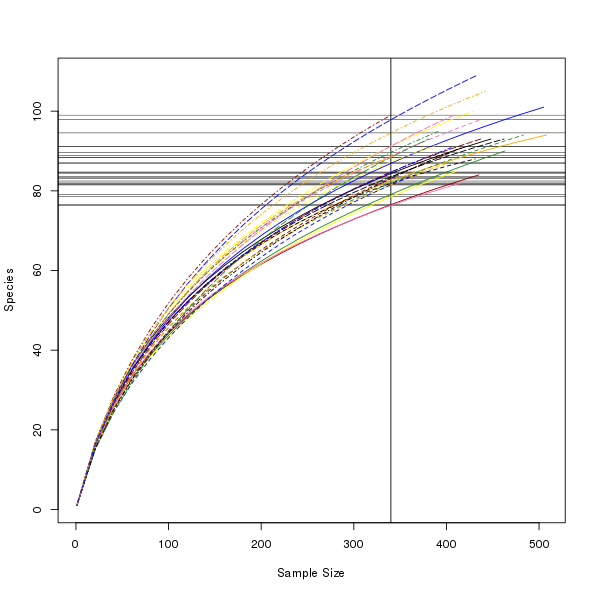
Note that I saved the output from rarecurve() in object out. This object contains everything we need to draw our own version of the plot if we wish. For example, we could use fewer colours and alter the line thickness1 instead to make up the required number of combinations.
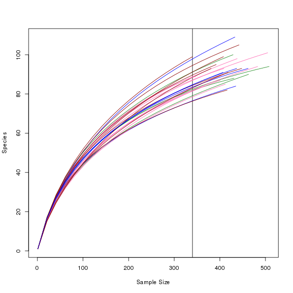
col <- c("black", "darkred", "forestgreen", "hotpink", "blue")
lty <- c("solid", "dashed", "dotdash")
lwd <- c(1, 2)
pars <- expand.grid(col = col, lty = lty, lwd = lwd,
                    stringsAsFactors = FALSE)
head(pars)
col lty lwd
1 black solid 1
2 darkred solid 1
3 forestgreen solid 1
4 hotpink solid 1
5 blue solid 1
6 black dashed 1Using the information in out returned by rarecurve() we can get almost the same plot using the following code to draw the elements by hand
Nmax <- sapply(out, function(x) max(attr(x, "Subsample")))
Smax <- sapply(out, max)
plot(c(1, max(Nmax)), c(1, max(Smax)), xlab = "Sample Size",
     ylab = "Species", type = "n")
abline(v = raremax)
for (i in seq_along(out)) {
    N <- attr(out[[i]], "Subsample")
    with(pars, lines(N, out[[i]], col = col[i], lty = lty[i], lwd = lwd[i]))
}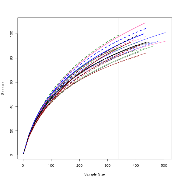
Having done this, I don’t believe this is a useful graphic because we’re trying to distinguish between too many samples using graphical parameters. Where I do think this sort of approach might work is if the samples in the data set come from a few different groups and we want to colour the curves by group.
col <- c("darkred", "forestgreen", "hotpink", "blue")
set.seed(3)
grp <- factor(sample(seq_along(col), nrow(BCI2), replace = TRUE))
cols <- col[grp]
The code above creates a grouping factor grp for illustration purposes; in real analyses you’d have this already as a factor variable in you data somewhere. We also have to expand the col vector because we are plotting each line in a loop. The plot code, reusing elements from the previous plot, is shown below:
plot(c(1, max(Nmax)), c(1, max(Smax)), xlab = "Sample Size",
     ylab = "Species", type = "n")
abline(v = raremax)
for (i in seq_along(out)) {
    N <- attr(out[[i]], "Subsample")
    lines(N, out[[i]], col = cols[i])
}
We can’t use the approach outlined in this example to vary
lwdbecause of the wayrarecurve()draws the individual curves, in a loop. We have no way to tellrarecurve()to use the ith element of a vector oflwdvalues.↩


